Font Fundamentals
The Vital Role of Font Choice in Web and Mobile Design
By Christopher Robison
2023-11-17
I hate starting out a new article. I never know how to break the ice; to get the ball rolling. Once I get started I’m fine. But getting started can be tough. I get in my head and start overthinking things: “How technical should I go?”, “Will they be reading this on their phones or desktop?”, “Will anybody actually read this besides me and my Mom?” or “Should I start with a joke? But in the end, I usually churn out something I would turn in to my 11th grade English teacher that I wrote the night before; a passable attempt but we both know I could do better. Well, this time I -will- do better, for you dear reader (Hi Mom!). Now would you look at that. I’m a paragraph in, rambling and very off topic. Let’s talk fonts. Let’s me start again…
As digital experiences continue to evolve, the choice of fonts in web and mobile design plays a pivotal role in shaping user engagement and readability. Like it or not, we now live in a world where we are inundated with information. How can anyone get their message to stand out amongst all the other billboards, ads, blog posts or images? By choosing the right design, typeface and font that will best convey your message and -engage- your audience. In this article I’ll give a short history of print and delve into why your font choice can make all the difference when it comes to getting your message across.

I must admit, when I started to write this post I thought it was going to be a quick and easy how-to on the use of some of the more modern font technologies such as variable and color fonts. How wrong I was. As I was researching and writing the history of the printed word I was astounded at how deeply influencial the written word has been on the development of humanity. From the early wide-spread use of pressing reeds into clay to form cuneiform tablets to the scrolls of ancient Greece and Egypt; to Gutenberg’s printing press and Martin Luther’s protest nailed to the door of the Wittenberg Church; to yellow journalism newspapers fanning the flames of war and the fake news of today, the printed word, by hand or machine, has had a profound impact on the development of our society.
Well that intro got a lot longer than I was planning but I apparently have a new passion and respect for fonts and print design. I should probably break this up into multiple posts. Anyway, we should all remember the long and arduous journey humanity has taken over the past 3,000 years to get us to where we are today. With a nearly unlimited array of designs choices to convey our messages and a historically unprecedented freedom to communicate with nearly anyone else on the planet at an instant, we need to take seriously how influencial a font choice can be to getting our message across. I know it sounds a little silly, but it’s the little things like this that can make all the differnece. Typography is not just about choosing a pretty typeface; it’s about communication, readability, and getting the user engaged with your message.
Font Vocabulary
The print & design industry have a vocabulary all their own. Western society has been pressing out books since 1454 (see what I did there?) and the list of words we use to describe how the print looks on paper has grown to be quite large. Seemingly similar concepts have subtle differences (see Legibility vs Readability, Typeface vs Font).
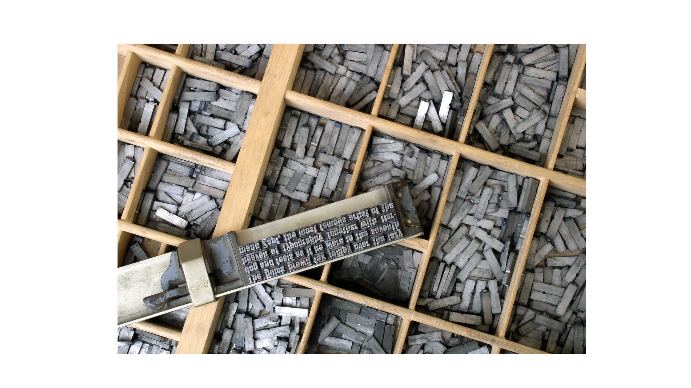
Yet, we use many of these terms everyday; Did you know we get the words “UPPERCASE” and “lowercase” from the original Movable Type Printing Press? The UPPERCASE letters were held in the, well in the upper case of the press. I’ll leave it as an exercise to the reader to guess where the lowercase letters were stored or is this just an apocryphal story?
I should warn you that I love to make lists. Love. Them. They help me keep my writing more concise. I don’t know if you’ve noticed, but I can get off topic and ramble on pretty easily but I’ve learned to be more succinct by using lists! So don’t be surprised if you come across a few lists in my posts. Speaking of lists, here’s a list of some basic terminology in the world of fonts and print design that I found to be interesting, confusing, ambiguous or just felt I needed to make note of:
Typeface vs. Font: A typeface is the design of the lettering (e.g., Times New Roman), while a font is a specific style and size of that typeface (e.g., Times New Roman, 12pt, Bold).
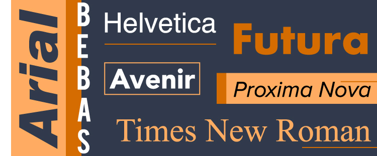
Serif vs. Sans Serif: Serif typefaces, like Times New Roman, have small lines at the end of their strokes, while sans-serif typefaces, like Arial, do not. Serifs are traditionally seen as more formal, while sans-serifs are viewed as modern and clean.
Legibility vs. Readability: Legibility refers to how easily individual characters can be distinguished, while readability is about how easy it is to read and understand blocks of text.
Hierarchy and Emphasis: Different fonts and styles (like bold or italic) are used to create a hierarchy or to emphasize certain parts of the content.
Sizing & Units: This starts to get a little out of scope here but…I just want to remind everyone that with a little up-front planning using responsive design, @media-queries and the right relative units, the same markup can be used for any screen size or print resolution. I am still surprised at the number of companies I still see maintaining multiple codebases for desktop and mobile websites. With variable fonts and color icon fonts you can make the same markup look good from 72dpi to 1200dpi. Down with bitmaps! Long live vector graphics!
Key Considerations
When we need a font, most of us will just scroll through the ‘Font’ menu until we see a font we like. But for any choice you need to make, you need to do your due diligence by defining the parameters and constraints your final choice will need to stay within. The choice of font you use will be driven by a number of things:
Target Audience: The choice of font should resonate with the target audience. For example, a children’s app might use a more playful font compared to a corporate website.
Platform: The platform (web, mobile, app) dictates font choices due to varying screen sizes and resolutions.
Brand Identity: Fonts should align with the brand’s personality – whether it’s formal, friendly, or avant-garde.
Accessibility: Consider users with visual impairments. Fonts should be legible and sizable to accommodate all users.
Performance: Heavier font files can slow down site speed, impacting user experience and SEO.
Now that we’ve covered the basics, let’s explore the importance of font choice in web and mobile design, including the innovative world of variable and color fonts.
Why Font Choice Matters in Digital Design
Font choices in print and web design are crucial for several reasons. I warned you about the lists:
User Engagement: The right font can improve user engagement. A well-chosen font can make text more appealing and inviting, encouraging visitors to stay longer on a website or read more of a printed piece.
Enhanced Readability: On smaller screens, fonts with larger x-heights and open spacing prevent straining the eyes, making content more accessible.
Tone and Mood Setting: Fonts can convey different moods and tones. For instance, a serif font like Times New Roman might convey formality and tradition, suitable for a law firm’s website, while a sans-serif font like Arial might feel more modern and informal, fitting for a tech startup.
Brand Identity: Fonts can be a powerful tool in conveying your brand’s personality and values.
Professionalism and Credibility: A well-chosen font can enhance the professional appearance of a design, lending credibility to the content. Poor font choices can have the opposite effect, making a design look amateurish.
Compatibility and Performance: On the web, font choice can affect loading times and compatibility across different devices and browsers. Some fonts are optimized for web use and ensure consistent rendering across various platforms.
Adaptability Across Devices: With an increasing variety of screen sizes, from desktops to smartwatches, fonts must be versatile and legible across all platforms.
As you can see, fonts are a very important and integral part of how you communicate with your audience. I must admit, I thought this would be a quick short blog entry on using color fonts but the more I researched and wrote, the more I realized how deeply influencial font choices can be and how underappreciated print design is. Well now that we’ve got the fundamentals out of the way, let’s get to the good stuff.
Implementing Fonts in Web and Mobile Design
We are going to take a look at how to implement this in practice using Google Fonts, a popular and versatile repository of fonts provided by Google that are free to use. They provide a variety of styles including some very convicing handwriting fonts.
HTML/CSS Example with Google Fonts
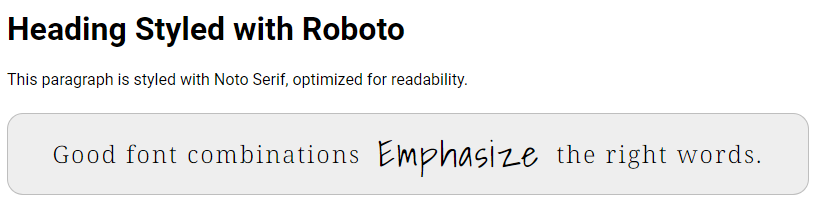
First, choose a font from Google Fonts. For this example, we’ll use ‘Roboto’, a highly legible sans serif font for web and mobile interfaces, ‘Noto Serif’, a very legible serif font and pair those with ‘Shadows Into Light’ as a companion font. Feel free to look through Google’s font collection and pick your own.
Let’s take a look at that markup:
HTML
<!DOCTYPE html>
<html>
<head>
    <link href="https://fonts.googleapis.com/css2?family=Noto+Serif:wght@300&family=Roboto:wght@300;400;700&family=Shadows+Into+Light&display=swap" rel="stylesheet">
    <title>Font Example</title>
</head>
<body>
    <h1>Heading Styled with Roboto</h1>
    <p>This paragraph is styled with Roboto, optimized for readability.</p>
    <p class='serif'>Good font combinations <span class='cursive'>Emphasize</span> the right words..</p>
</body>
</html>
CSS
body {
    font-family: 'Roboto', sans-serif;
}

h1 {
    font-family: 'Roboto', sans-serif;
    font-size: 2em; /* Larger size for headings */
    font-weight: 700; /* Bolder weight for impact */
}

p {
    font-size: 1em; /* Standard size for body text */
    font-weight: 400; /* Regular weight for readability */
}

.serif {
    font-family: 'Noto Serif', serif;
    font-size: 1rem;
    width: 80rem;
    border-radius: 1rem;
    height: 4rem;
    background-color: #ccc;
}

.cursive {
    font-family: 'Shadows Into Light', cursive;
    font-size: 1.2rem;
}
Result
The Future with Variable and Color Fonts
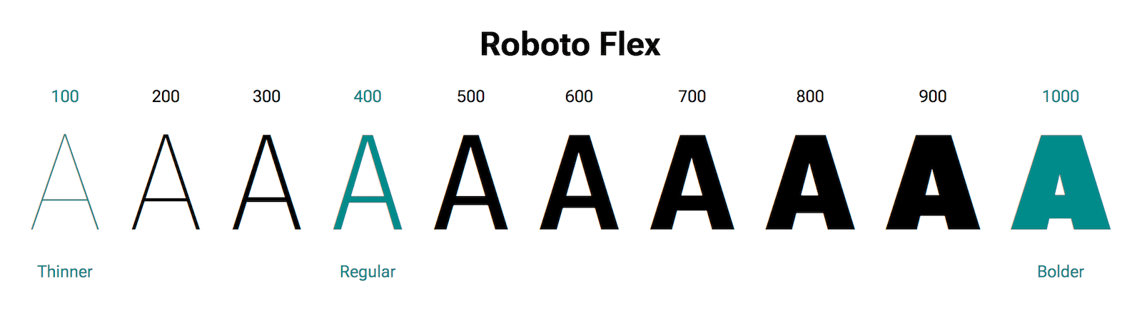
Variable Fonts
Variable fonts represent a significant advancement in digital typography. They allow a single font file to behave like multiple fonts, offering a range of styles, weights, and widths. This is particularly beneficial in web and mobile design for several reasons:
Efficiency: A single variable font file can replace multiple font files, reducing load times and improving website performance.
Flexibility: Designers can fine-tune the style, weight, or width of the font dynamically, offering greater creative control over typography.
Improved User Experience: They allow for real-time adjustment of fonts according to user preferences or device characteristics, enhancing accessibility.

Using a variable font is as easy as using a normal, non-variable font. The only difference is the size of the variable font file can be quite a bit larger as they must store more information for each character. Something to keep in mind if you are targeting mobile users or users with slow connections. Here’s how you can implement a variable font using Google Fonts:
HTML
<!DOCTYPE html>
<html>
<head>
    <link href="https://fonts.googleapis.com/css2?family=Roboto+Flex&display=swap" rel="stylesheet">
    <title>Font Example</title>
</head>
<body>
    <h1>Heading Styled with Roboto</h1>
    <p>This paragraph is also styled with Roboto, optimized for readability.</p>
</body>
</html>
CSS
body {
    font-family: 'Roboto Flex', sans-serif;
    font-variation-settings: 'wght' 400, 'wdth' 100;
}

h1 {
    font-size: 2em; /* Larger size for headings */
    font-weight: 700; /* Bolder weight for impact */
}

p {
    font-size: 1em; /* Standard size for body text */
    font-weight: 400; /* Regular weight for readability */
}
As you can see, implementing a variable font is identical to using a
normal font, we just update the font to download and change the CSS to
reflect the new font name. If anything, it’s even easier as we do not
need to specify each weight and varient we want to use when we include
our external font. They are all included in the variable font. So in
this example, you can adjust the wght and wdth
associated with ‘Roboto Flex’ to change how the weight and width axes
are rendered. You can adjust these values throughout your CSS to suit
your design needs.
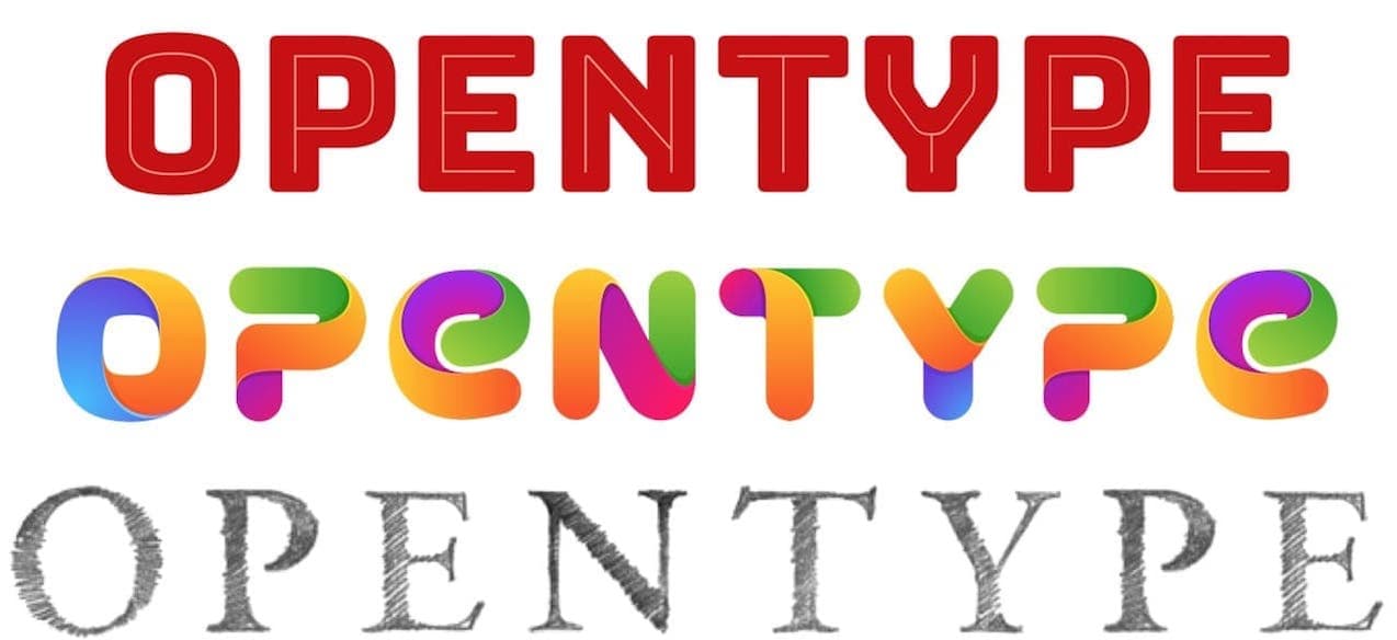
Color Fonts
Uses and Abuses

I love color fonts. There are some purists out there that feel text should only be a single color, black. They cite readability concerns and start mumbling something about Edward Tufte and ComicSans. But color fonts, also known as chromatic fonts, are the latest innovation in typography and they bring the richness of color and texture into text. While this opens up new possibilities for branding and design, allowing fonts to include multiple colors, gradients, and even textures it also provides opportunity for creating designs that are busy and difficult to read. In web design, color fonts can be used to:
Enhance Branding: Color fonts can include brand colors and textures, making text an integral part of the brand identity.
Improve Visual Interest: They add a new dimension to typography, making it more visually appealing.
Create Consistent Aesthetics: Using color fonts can ensure consistent color schemes across different platforms.
Provide icons for UI or social networks: Including icons in a font in nothing new (see FontAwesome), color fonts allow us to go a step further and create our own bespoke fonts containing all the social service and user interface icons we need for our site or application.
How They Work
A color font file is actually just a regular font file that embeds additional data to display more graphic properties than the contour shapes of a character.
Color fonts are now generally stored as SVG data inside OpenType font files. This SVG (Scalable Vector Graphics) format can hold vector shapes with color or gradients, and may also include bitmap images - thus leading to bitmap fonts.
On top of all this, While doing research for this article I discovered that color fonts are now officially referred as OpenType-SVG fonts.
You’re probably thinking how simple, straightfoward and level-headed this all sounds. Nothing but sunshine and rainbow fonts. Right?
Well, the reality is a bit more complex…
Time For Some History
The OpenType-SVG font format was initially designed by Mozilla & Adobe and became an industry standard in early 2016, when other big players including Microsoft & Google agreed on a single format to support color fonts.
 All of them (including Apple) have previously developed and implemented
their own proprietary color formats to display emojis on their operating
systems, while many other companies built other custom color font
technologies for the gaming, video or print industries.
All of them (including Apple) have previously developed and implemented
their own proprietary color formats to display emojis on their operating
systems, while many other companies built other custom color font
technologies for the gaming, video or print industries.
There are now four major color font formats that fit into regular font files: SBIX, COLR, CBDT and SVG, each having it own specificities. Read the full story here or check out my simplified recap:
| Vector | Bitmap | Native support | |
|---|---|---|---|
| W3C [SVG] | ✔ | ✔ | macOS 10.14+, iOS 12+, Windows 10+ |
| Apple [SBIX] | ✔ | macOS and iOS | |
| Google [CBDT] | ✔ | Android | |
| Microsoft [COLR] | ✔ | Windows 8.1+ |
Due to the differences and incompatibilities of these formats, the design industry is going through a transition period during which several color font formats may be needed to ensure cross-platform compatibility across several operating systems, browsers and apps.
But OpenType-SVG seems in great position to become a golden standard now that three operating systems support OpenType-SVG fonts: Windows 10, macOS Mojave, and iOS 12.
A solution to mitigate this issue on legacy software? Color fonts can also include some alternate vector shape data as a fallback solution for software that do not (yet) support any of the embedded color formats.
What’s the Catch?
File size
So as you’ve probably guessed by now, there are drawbacks to color fonts. The biggest one is filesize (see what I did there?). A color font file is generally larger than a regular font file, and a lot more so when the font embeds high-resolution bitmap characters.
Whereas fonts usually weigh 10-100 kilobytes, color vector fonts can reach 100KB to 2MB+ depending on their visual complexity.
Color bitmap fonts may range from a few megabytes to tens of megabytes, and sizes increase when multiple color font formats are embedded in a single file.
Implementation
Implementing color fonts can be as simple as using them in your CSS, similar to regular fonts. However, it’s important to ensure compatibility, as support for color fonts can vary across different browsers and devices. Color fonts hijack a feature for rendering of diacritic marks, such as umlauts (¨), over vowels in order to render multiple layers of charaters over each other in order to achieve the effect. Just be sure to test thoroughly in all your potential environments to ensure proper rendering when using color fonts.
Final Thoughts
The world of web and mobile typography is becoming more vibrant and alive with the advent of these latest font capabilities. These innovations offer designers unprecedented flexibility and creative possibilities, making it an exciting time to be in web and mobile design. As always, the key is to balance creativity with functionality, ensuring that your design choices enhance the user experience. The right font choice is key to creating an engaging and accessible digital experience. By considering optical sizing and using tools like Google Fonts, designers can craft visually appealing and functional web and mobile interfaces. Remember, typography is not just about making words readable; it’s about bringing content to life.
Leave a Reply
Comment? Suggestion? Just plain mad? Why not Leave a comment and let everyone know what you're thinking. Your email address will never be shared or published. Required fields are marked *